
Enterprise Level Dashboard
An enterprise-level dashboard is a powerful tool that offers a unified view of energy performance indicators (EnPIs) and metrics across an organization. By integrating data from various regions and sites, it enables real-time monitoring, analysis, and decision-making. This dashboard empowers executives and managers to track progress, identify trends, and make informed strategic decisions, ultimately enhancing overall business performance.
Enterprise Level Dashboard
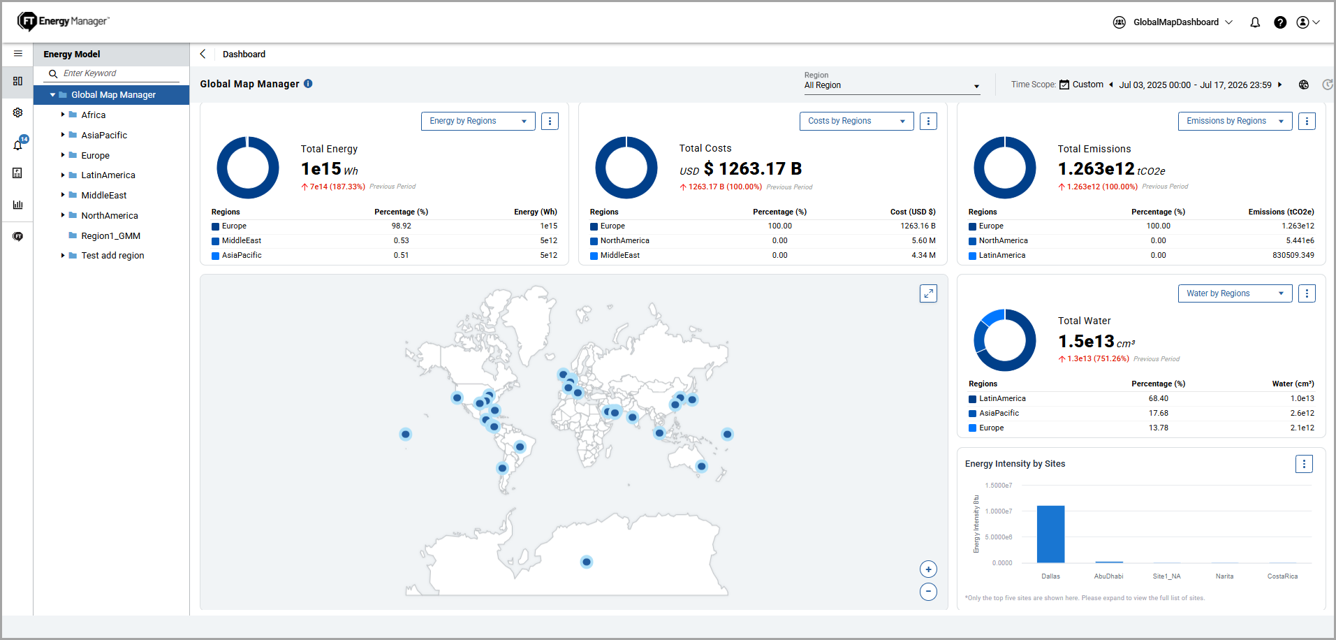
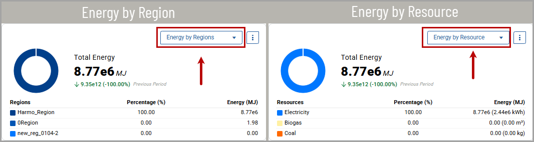
Total Energy
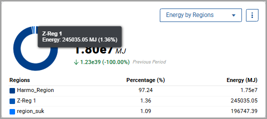
: This widget displays the total energy consumption at the Enterprise level:- Donut Chart: Provides a visual representation of the total energy consumption of each region/resource as a percentage. Hover over to view the individual data for the region/resource.Total Energy - Donut Chat
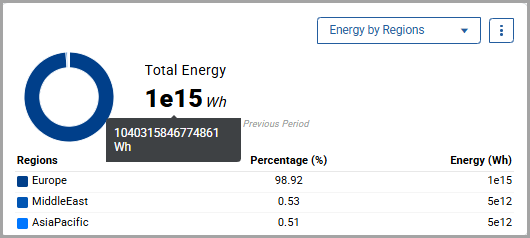
- Total Energy: Displays the total energy consumed in exponential notation. Hover over a value to view the actual energy consumption.Total Energy
 The chart also shows the change from the previous time scope. Green text indicates lower energy consumption, and red text indicates higher energy consumption.Total Energy - Lower and Higher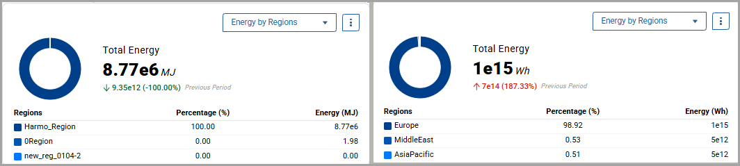
- Table: Displays the top three regions/resources that consume the highest energy in descending order.
- Energy by Region/Resource: This dropdown allows the user to switch between consumption of energy by region and resource. Based on the selection, the table displays the top three regions or resources.Energy by Region/Resource
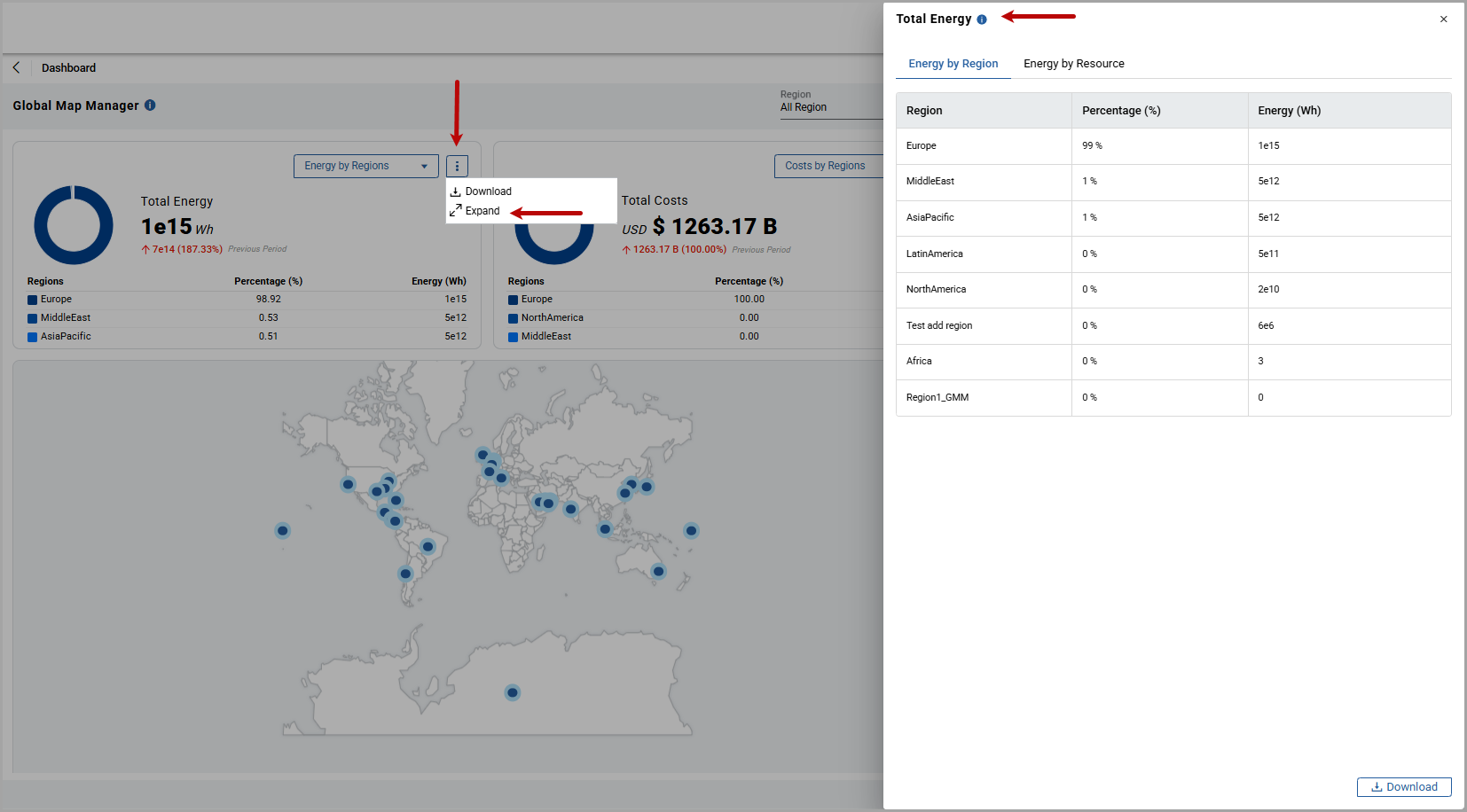
- Expand: Allows the user to view energy consumption of all regions/resources in a pop-up window.
- Click the ellipsis icon [
 ] and click Expand.
 - Click the info icon [
 ] to view the time scope.
 - Expand Widget
- Download: Allows the user to download the energy consumption report in CSV format. This CSV file name represents the timespan selected for this data.
- Click the ellipsis icon [] and click Download.The user can also download the report from the expanded view.
- After the download, the “Exported successfully” message is displayed. The exported CSV file displays values in expanded number format (including decimals, when available) instead of exponential notation. The user can use the CSV file for further analysis and visualization.
Total Costs
: This widget displays the total costs at the Enterprise level.Total Costs
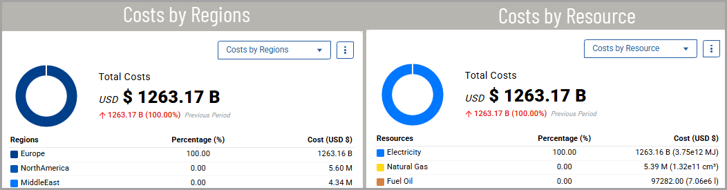
- Donut Chart: Provides a visual representation of the total costs for each region/resource as a percentage. Hover over to view the individual cost for each region/resource.
- Total Costs: Displays the total costs in exponential notation. Hover over a value to view the actual cost. The chart also shows the change from the previous time scope. Green text indicates that costs decreased compared to the previous time scope, and red text indicates that costs increased.
- Table: Displays the top three regions/resources of costs in descending order.
- Cost by Region/Resource: Use this dropdown to switch between viewing costs by region or by resource. The table updates to display the top three regions or resources based on your selection.
- Expand: Allows the user to view costs of all regions/resources in a pop-up window.
- Click the ellipsis icon [] and click Expand.
- Click the info icon [] to view the time scope.
- Download: Allows the user to download the cost report in CSV format. This CSV file name represents the timespan selected for this data.
- Click the ellipsis icon [] and click Download.The user can also download the report from the expanded view.
- After the download, the “Exported successfully” message is displayed. The exported CSV file displays values in expanded number format (including decimals, when available) instead of exponential notation. The user can use the CSV file for further analysis and visualization.
Total Emissions
: This widget displays the total emissions at the Enterprise level.Total Emissions
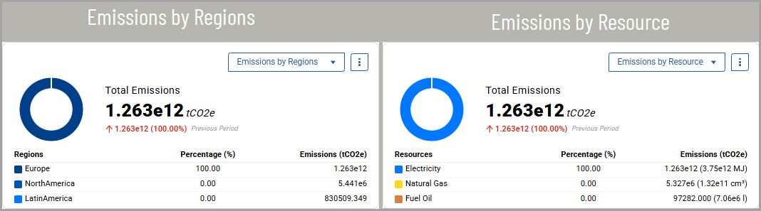
- Donut Chart: Provides a visual representation of the total emissions of each region/resource as a percentage. Hover over to view the individual emissions for each region/resource.
- Total Emissions: Displays the total emissions in exponential notation. Hover over a value to view the actual emission value. The chart also shows the change from the previous time scope. Green text indicates that emissions decreased compared to the previous time scope, and red text indicates that emissions increased.
- Table: Displays the top three regions/resources of emissions in descending order.
- Emissionsby Region/Resource: Use this dropdown to switch between viewing emissions by region or by resource. The table updates to display the top three regions or resources based on your selection.
- Expand: Allows the user to view costs of all regions/resources in a pop-up window.
- Click the ellipsis icon [] and click Expand.
- Click the info icon [] to view the time scope.
- Download: Allows the user to download the emissions report in CSV format. This CSV file name represents the timespan selected for this data.
- Click the ellipsis icon [] and click Download.The user can also download the report from the expanded view.
- After the download, the “Exported successfully” message is displayed. The exported CSV file displays values in expanded number format (including decimals, when available) instead of exponential notation. The user can use the CSV file for further analysis and visualization.
Global Map Overview
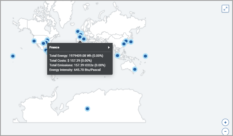
: This chart provides a centralized, map-based view of energy consumption and performance metrics across all enterprise sites. It allows users to view key Energy Performance Indicators (EnPIs) — including Harmonized Energy, Costs, Emissions, and Energy Intensity — plotted on the world map, enabling users to quickly identify high-energy-usage regions, compare site performance, and prioritize efficiency improvements at a glance.Global Map Overview
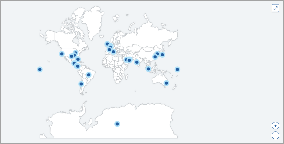
- Hover Over: Hover over a site marker to view its total energy consumption, costs, CO₂ emissions and energy intensity.Hover Over
- Navigate to Sites: Hover over a site and click the [
 ] icon to navigate directly to the Site Dashboard.Navigate to Site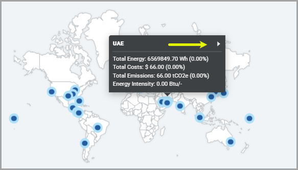
- Expanded View: Click the Expand icon [
 ] to view the Global Map for better visualization.Expanded View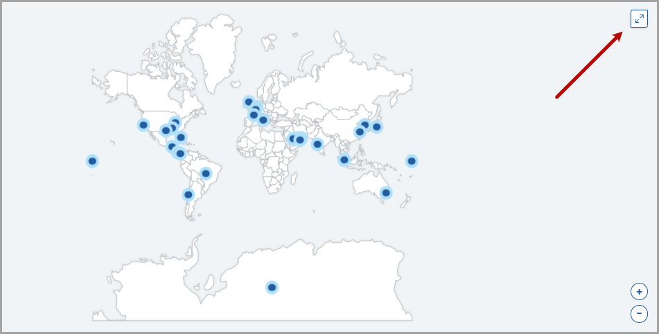
- Zoom in/out: Use the [+] and [−] icons, or scroll on the map to explore a particular region.Zoom In/Out
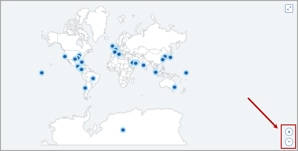 NOTE:The map view expands to fill available space when the Energy Intensity or Water widgets are hidden.
Total Water
: This widget displays the total water consumption, rolled up from the site level.
NOTE:
This widget does not include data from Chilled Water, Hot Hot Water and Hot Water.
Total Water
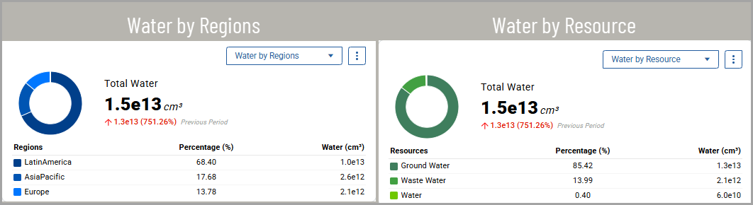
- Donut Chart: Provides a visual representation of the total water consumption of each region/resource as a percentage. Hover over to view the individual water consumption for each region/resource.
- Total Water: Displays the total water consumption in exponential notation. Hover over a value to view the actual water consumption value. The chart also shows the change from the previous time scope. Green text indicates that emissions are lower than in the previous time scope, and red text indicates higher water consumption.
- Table: Displays the top three regions/resources (Water Type) of water usage in descending order.
- Waterby Region/Resource: Use this dropdown to switch between viewing water usage by region or by resource. The table updates to display the top three regions or resources based on your selection.
- Expand: Allows the user to view water usage of all regions/resources in a pop-up window.
- Click the ellipsis icon [] and click Expand.
- Click the info icon [] to view the time scope.
- Download: Allows the user to download the water usage report in CSV format. This CSV file name represents the timespan selected for this data.
- Click the ellipsis icon [] and click Download.The user can also download the report from the expanded view.
- After the download, the “Exported successfully” message is displayed. The exported CSV file displays values in expanded number format (including decimals, when available) instead of exponential notation. You can use the CSV file for further analysis and visualization.
Energy Intensity by Sites
: This widget displays the Top 5 sites by energy intensity. This bar chart displays the sites on the X-axis and energy intensity on the Y-axis.- Bar Chart: Provides a visual representation of the energy intensity got top five sites. Hover over each site to view the individual energy intensity.
- Expand: Allows the user to view the energy intensity by sites in a pop-up window.
- Click the ellipsis icon [] and click Expand.
- Click the info icon [] to view the time scope.
- Download: Allows the user to download the energy intensity by sites report in CSV format. This CSV file name represents the timespan selected for this data.
- Click the ellipsis icon [] and click Download.The user can also download the report from the expanded view.
- After the download, the “Exported successfully” message is displayed. The exported CSV file displays values in expanded number format (including decimals, when available) instead of exponential notation. You can use the CSV file for further analysis and visualization.
Refer to Dashboard Features section to manage the Enterprise-Level dashboard.
Related Links
:Provide Feedback