
Navigate the interface
The
Library Designer
interface is organized into a three-pane display composed of two panels with toolbars and object trees and a third panel that contains object decorations (properties and parameters).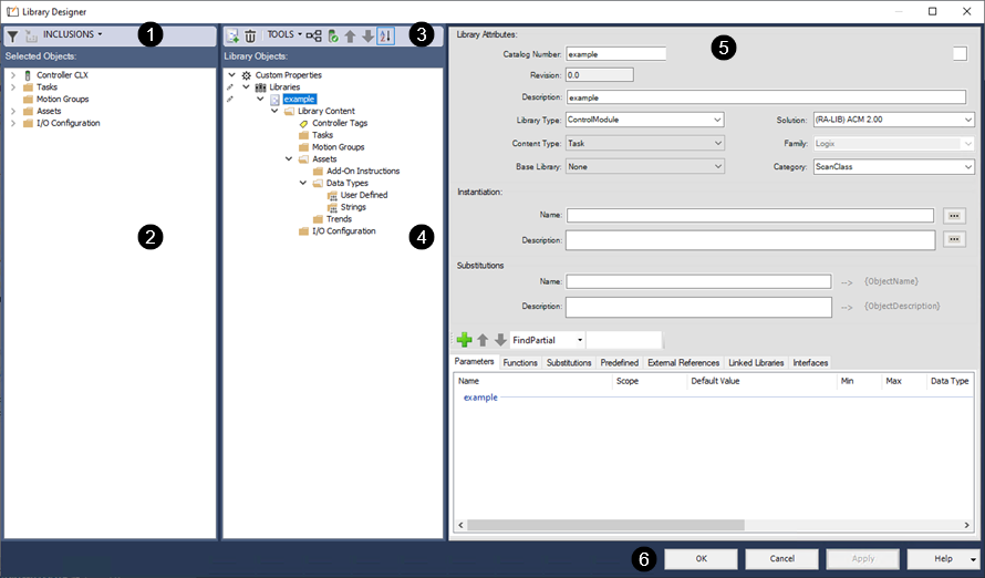
This table describes the regions and controls on the
Library Designer
interface.Interface element | Description | |
|---|---|---|
 | Selected Objects toolbar | The Selected Objects toolbar has three elements:
|
 | Selected Objects tree view | The Selected Objects tree view follows the structure of the Controller
Organizer view or the Logical Organizer view in Studio 5000 Logix Designer® . The display varies depending on the item
selected when the Library Designer was opened. It includes the object or
objects that were selected and all referenced elements from the Project.An object may be associated with one or many library objects, depending on the ownership settings for the project. For example, an Add-On Instruction may be associated with both a valve library object and a motor library object. Click  to the left of an item in the tree to display the elements that are contained within it. Click to the left of an item in the tree to display the elements that are contained within it. Click  to collapse the item. to collapse the item.Objects are color-coded to indicate whether all, some, or none of the associations from the initial instance in Studio 5000 Logix Designer have been replicated in the library objects added in Library Designer .
|
 | Library Objects toolbar | The Library Objects toolbar has five elements:
|
 | Library Objects tree view | This column displays a tree view of all library objects included in the current project or ACD file. Library objects are structured in a three-level hierarchy: Project library object Controller library object Logix Object library objects: Tasks, Programs, Modules A project can include project library objects, controller library objects, and multiple Logix object library objects. Library objects have a three-level structure: Catalog Number Library Content Folder Controller Tags Tasks Motion Groups Add-On Instructions Data Types I/O Configuration The structure contained in each library object matches the structure of a project created in the Studio 5000 Logix Designer application, and all elements included in the library object are placed at the appropriate location in the project hierarchy. This makes it possible for the library object of a valve that is dependent on controller tags, Add-On Instructions, and data types to include all of these required elements when it is instantiated in an Application Code Manager project.The color of the text in the tree denotes whether the element is included in the library.
|
 | The decorator panel becomes active when an element within a library object is selected. The decorator panel displays the fields and functions available to add, modify, or delete decoration. The display changes based on the currently selected element and its location within the library object structure. Settings that can be edited display with white backgrounds. Settings that are locked for editing appear dimmed. Settings that can accept calculated values are followed by the ellipsis (...) button. Clicking this button opens the Expression Builder. | |
 | Commands | The Library Designer uses standard commands:
|
Provide Feedback