Apply Filters to Selected Sections of Data
- Selectyour tab labelled “Efficiency2 vs Fuel and DeltaT”. We want to explore why this does not look like the Efficiency versus Power plot (e.g. why is efficiency low at around the 4000 Lb/Hr region). With your mouse about 0.9 efficiency and 3750 Lb/Hr fuel gas,press/hold“Alt”, thenselectyour mouse and drag to include the unusual clusters of data (~1.5 Efficiency, 4180 Lb/Hr fuel) andlet goof your mouse and Alt (Alt-mouse-drag/let go mouse, let go alt). This highlights a section of your data (across all relevant plots row-plots, not time-plots currently). Multiple highlight selections (interactions) are OK. Shift-Alt on the same steps clears selected highlight sections.Highlight Section with Alt-key drag select
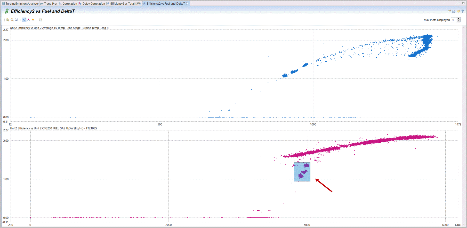 Highlighted Sections Displayed on all Plots
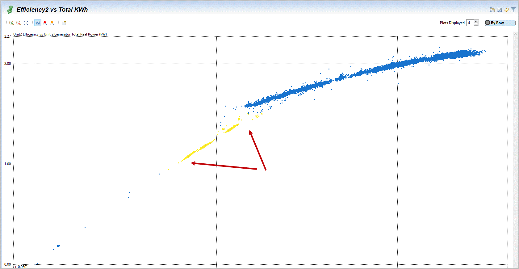 Highlighted Sections on Trendplot
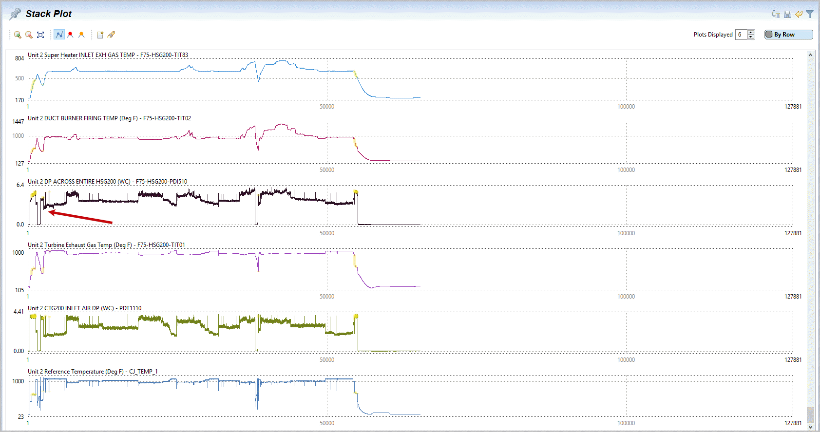
- Selectagain your correlation’s tab and create xy plots on the same variables for Unit1 (e.g. first “Efficiency1 vs Total KWh” and “Efficiency1 vs Fuel and DeltaT”) byselectingthe correlation indicating the first two variables,right mouse-click, selectPlot and XY Plot. Then again selecting both correlations on Unit1 Efficiency with its Fuel flow and its DeltaT. I show also selecting the Unit1 Percent of fuel flow to pilot manifold as well. You can alsorenamethe two new XY plots as before to have an identification of each tab.Generate Unit1 XY plot for efficiency vs power
 Generate xy plot for Efficiency1 vs Fuel and DeltaT
- Notethe same sections of load for Unit 1 are displayed as previously highlighted on Unit 2. But remember that this was selected in range for Unit 1 and displayed highlighted for these common times/rows – not the same range on Units 1 and 2. What we have discovered is that when Unit 1 runs at mid-range and shows deviations on efficiency, temperature and other patterns, this is the unusual time where both Unit 1 and Unit 2 are both in operation (thus both highlighted). It appears we have discovered that when both Unit 1 and Unit 2 are in operation they interact with each other and cause efficiency to drop. We will try to verify this further later in this section.Highlighted Region on xy plot of Efficiency Unit1
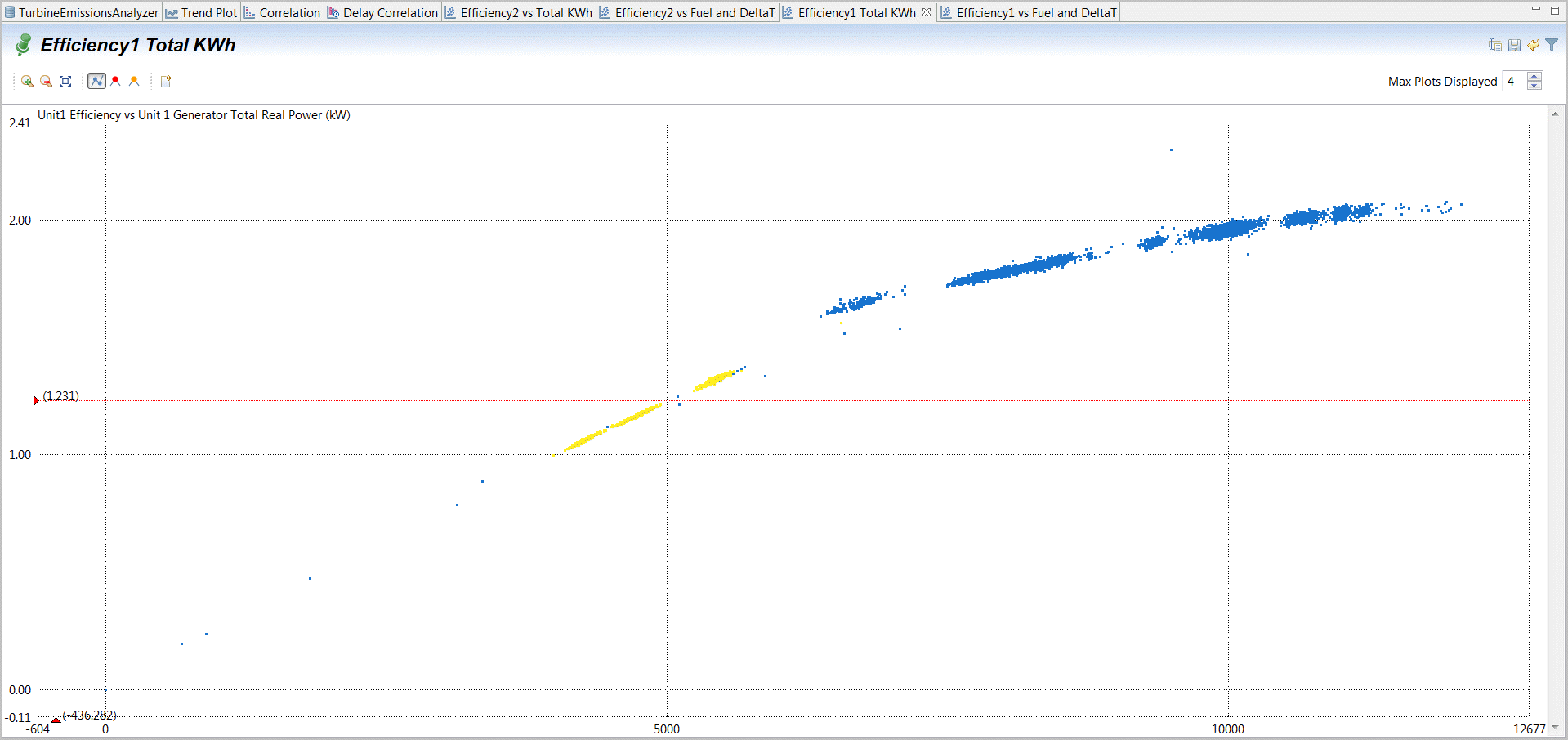 Highlighted Regions on more Unit1 xy plots
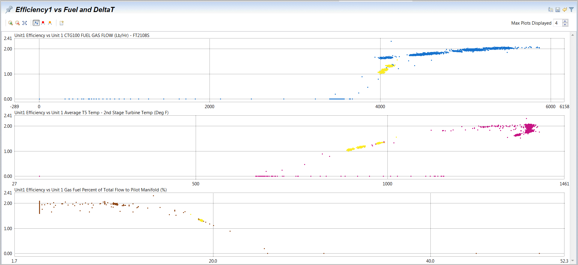
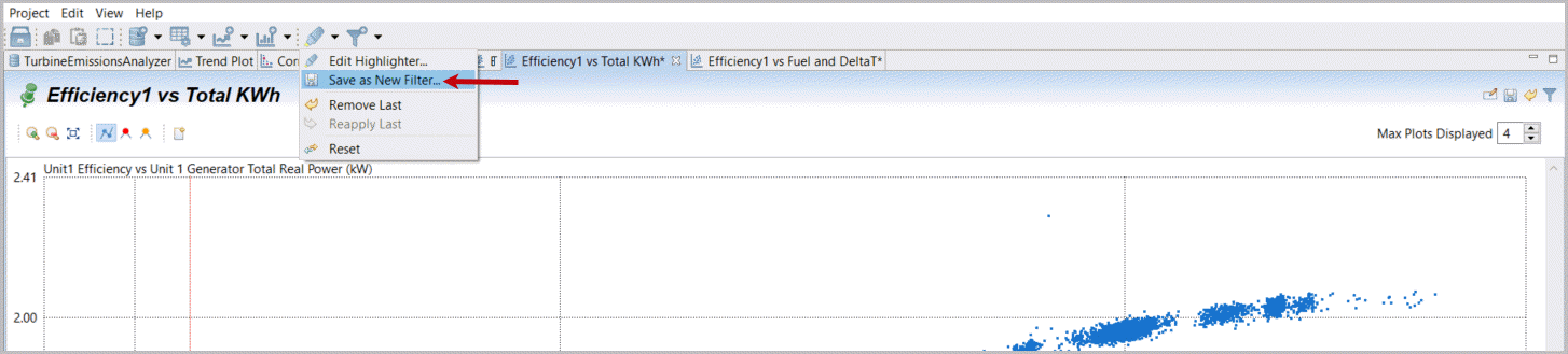
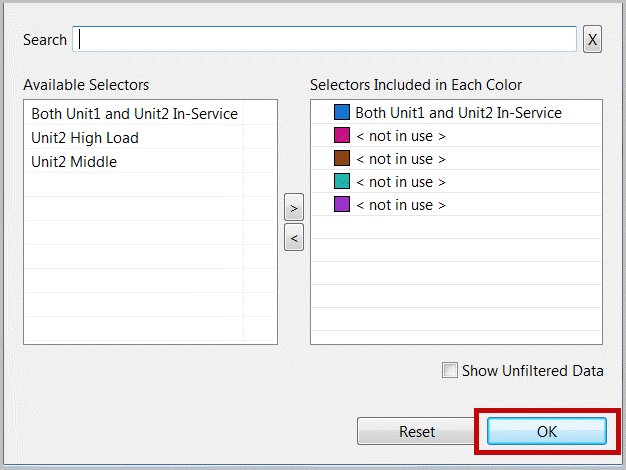
- A highlighter icon has options for what to do with highlighted sections including: Edit the selections, Save as a data Filter (selector), remove the last highlight selection step or reset (clear) all highlighting actions.Selectandchoose“Save as New Filter” and call it “Unit2 Middle”. Highlighters are rapid graphical ways to select data from most plots (but should be considered temporary). Filters are designed to retain data in rules for reuse later and multiple filter sets can be defined and saved Pin (Save it).Convert Highlighted Region to New Filter
 Label and Save Filter
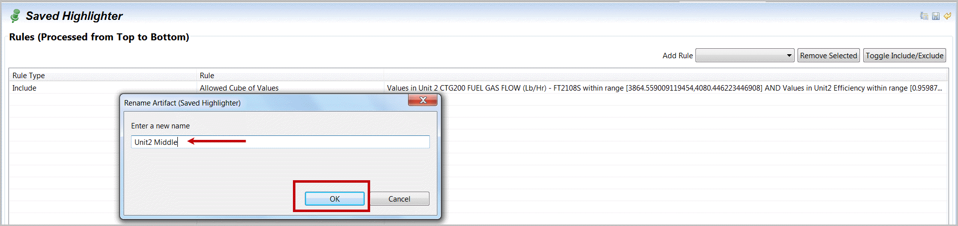
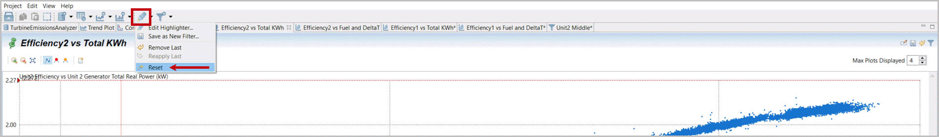
- Selectthe original xy plot, “Efficiency2 vs Total KWh”.Selectthe highlighter icon and the option Reset to clear our highlighted section.Selectthe plot,right mouse-clickandselectFilter andKeepAbove. ThenselectUnit 2 Generator Total Real Power from the two variables. We want to create a new filter directly for Power above 5850.Reset (Clear Highlighter)
 Create a New Filter at High Power
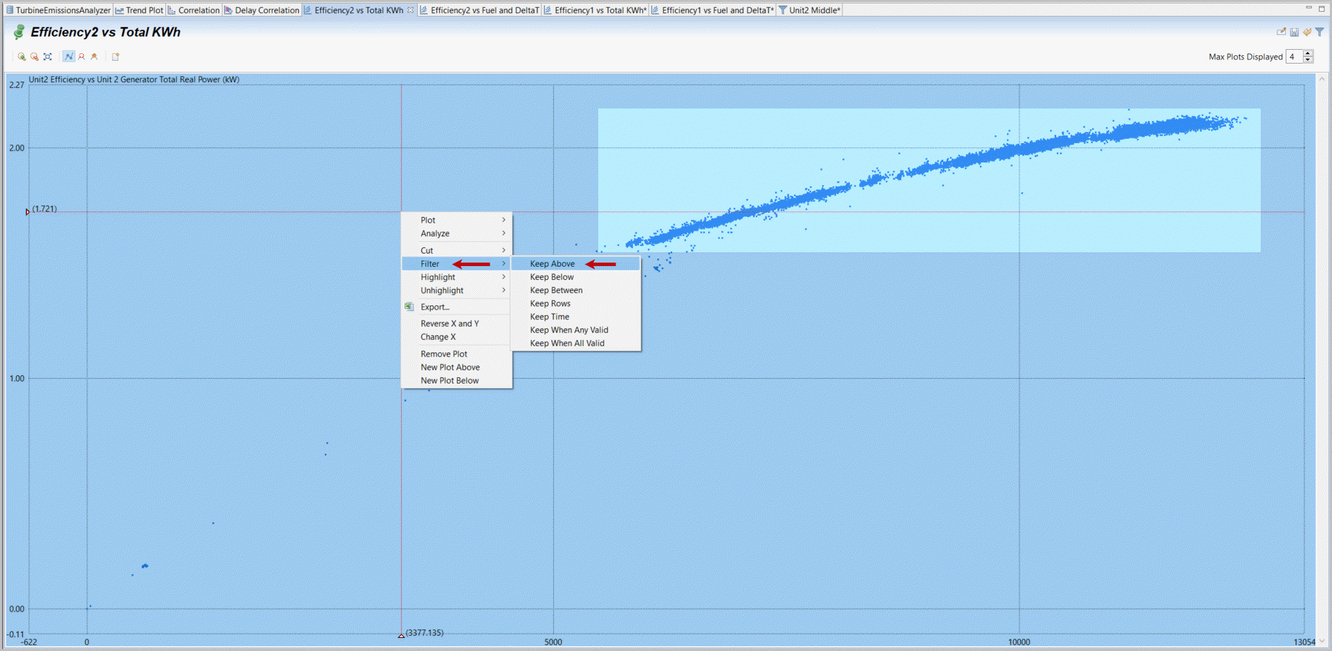
- Set the Filter limit to 5850 and observe if this seems to capture most of the 'normal' operations. Select Apply. Create a filter for “Unit2 High Load” and label it this.Filter Above Values for High Unit 2 Power
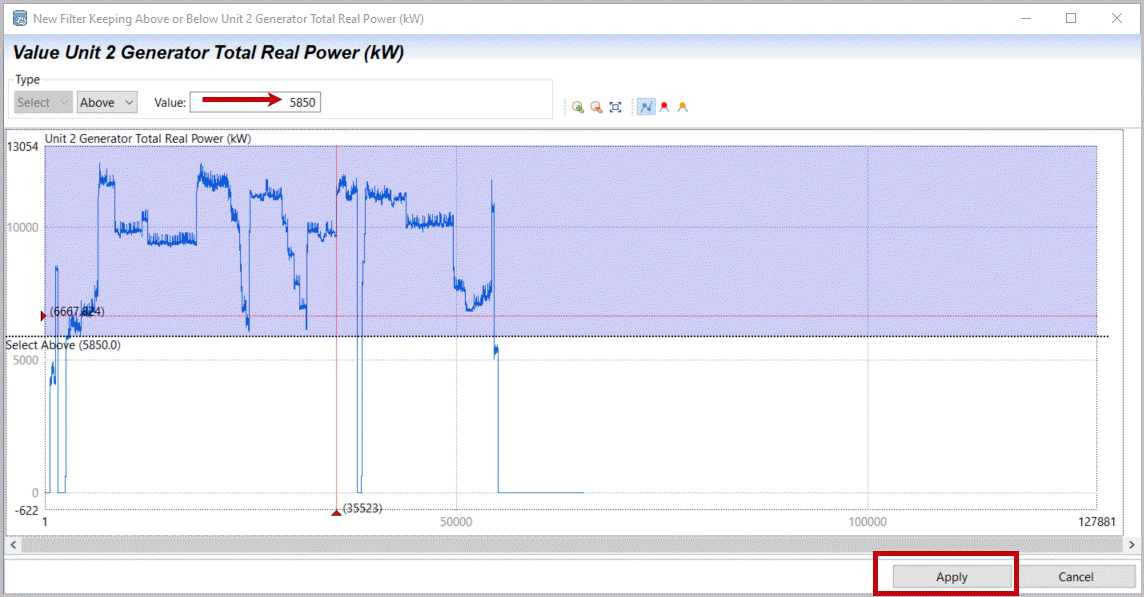 Filter Above Power Limit
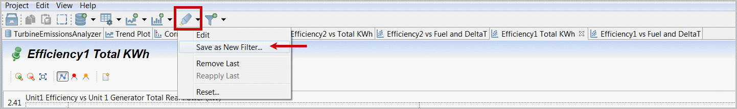 Label and Save new Filter
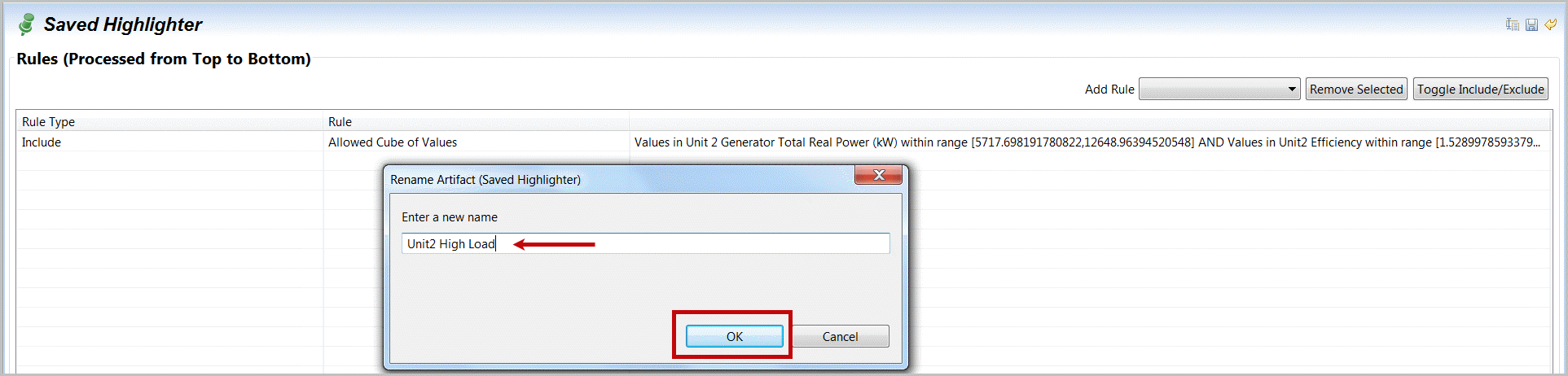
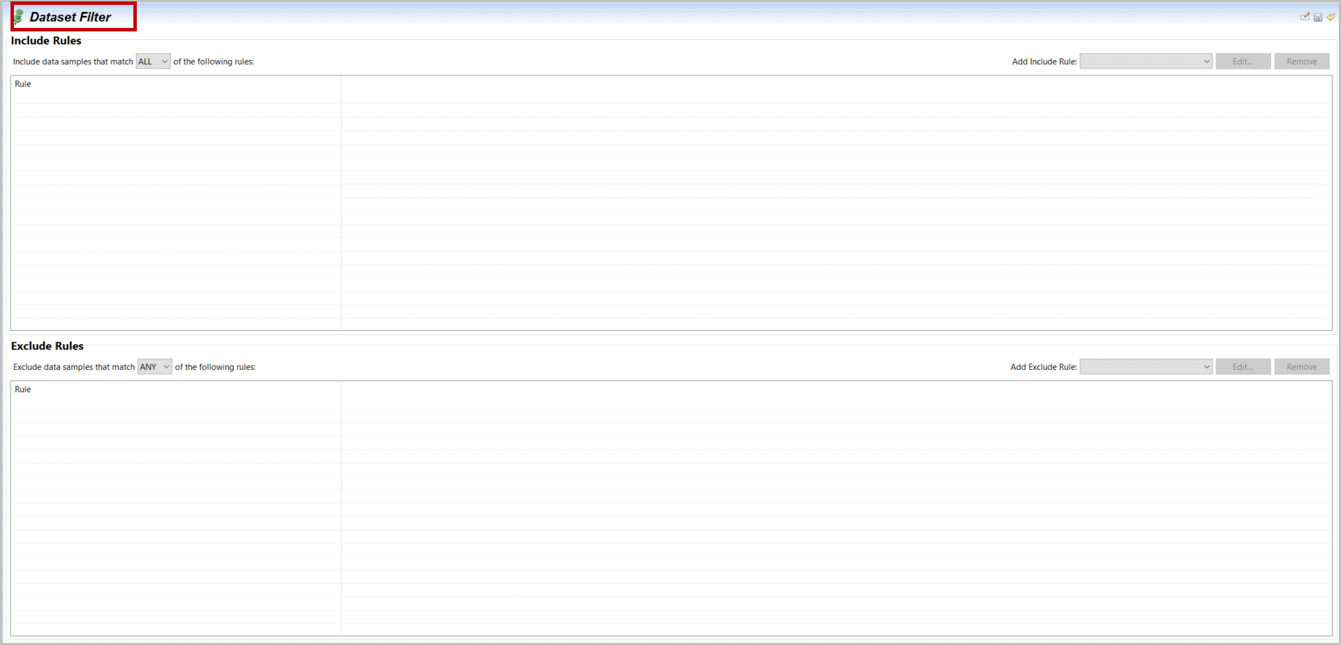
- Explore the upper right Filter options that allow additional logic or changes in your previously Filtered selection. Ranges of Rows, Times, Statuses, Values or other filters can be added, as include or exclude rules. Also note the Any/All logic (i.e. 'or' or 'and') that may be useful with multiple filter rules.Extend Filter Options
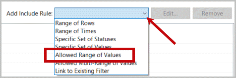
- Set is appropriate for discrete parameters. If you select any of these you will have access to a representative window to define your desired selection rules set. Note you may also define filters from other plots and range of values can be graphically defined. This can be quicker and easily combined by adding filters together.Allowed Range of Values Configuration
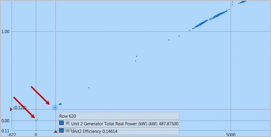
- To close our validation of our suspected interaction between Unit 1 and Unit 2 operation we will use Filters directly to identify whenever both Unit 1 and Unit 2 are in service.Observeboth Unit 1 and Unit 2 Efficiency versus Total Power plots to see it appears Unit 2 has operating data at lower ranges.Putyour mouse over this low, but in-service load you can identify a lower, but running range of above 400 KWhr. Alternatively you may choose an even lower (above 0) value of 38 KWhr.Selectthe top Filter icon and create a “New” Filter.Investigate xy plot for 'in-service' detection
 Create New Filter Manually
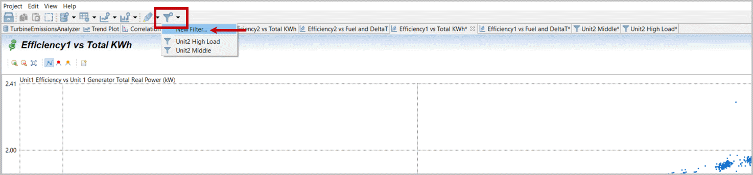
- Change the filter name to “Both Unit1 and Unit2 In-Service” by double-clicking the current name “Dataset Filter”.New Undefined Filter
 Label New Filter
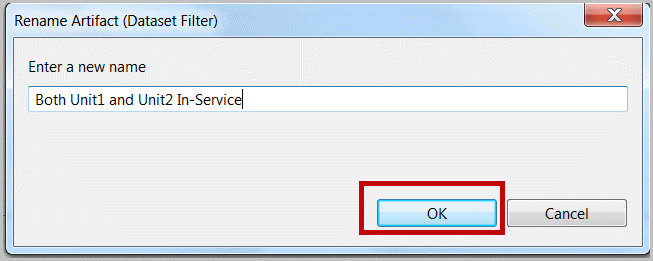
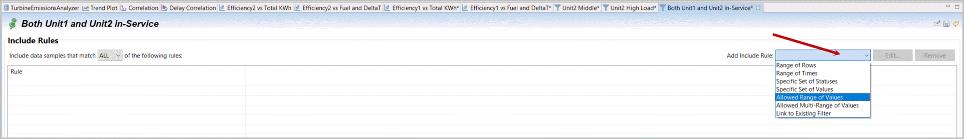
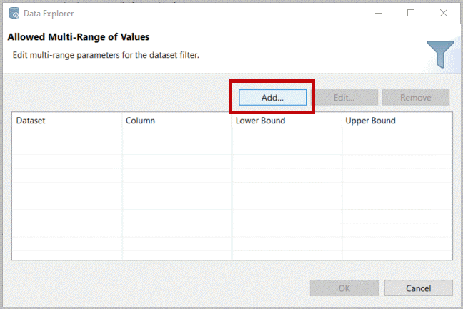
- Select“Add Include Rule” and select “Allowed Range of Values”. (note Set of Values applies to discrete columns, cube of values as used before is a box from an xy-like selection).Add new filter rule - range of values
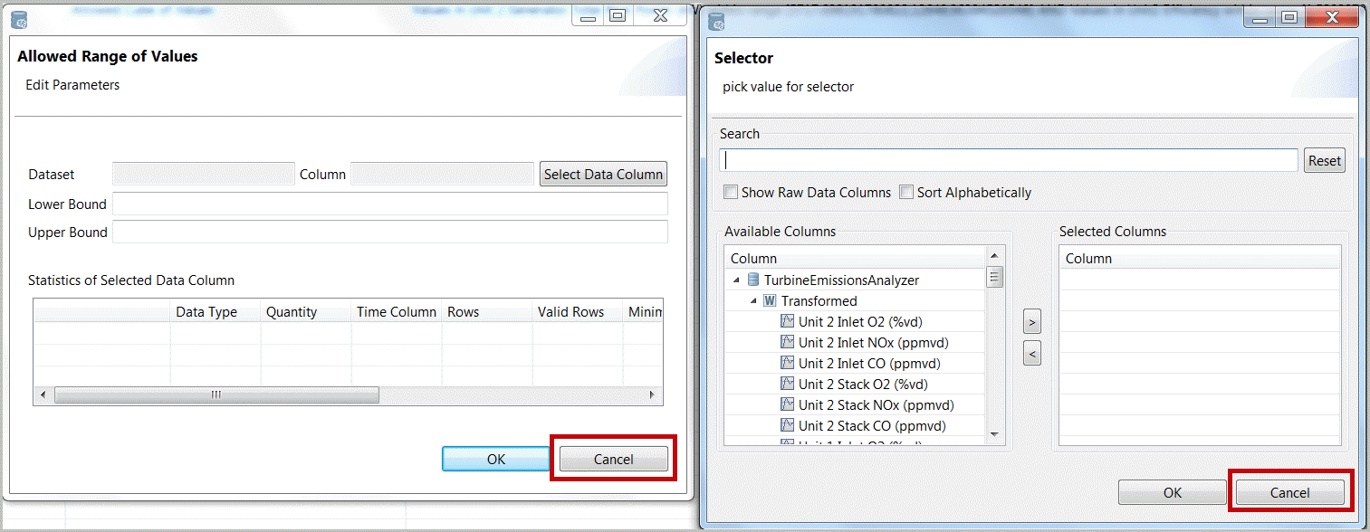
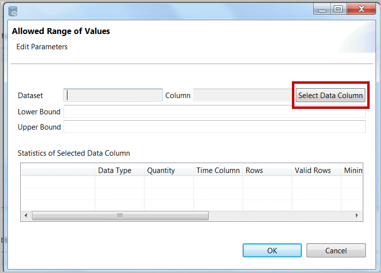
- Selectthe “Select Data Column” andSelect‘Unit 1 Generator Total Real Power (KW)’. You may reduce or more easily find desired tags with the Search key (here KW).SelectUnit 1 Generator Power Enter the lower bound (either something like 35 or 400 as determined previously).SelectOK again.Configure Range of Values Filter
 Select One Variables for Filter Rule
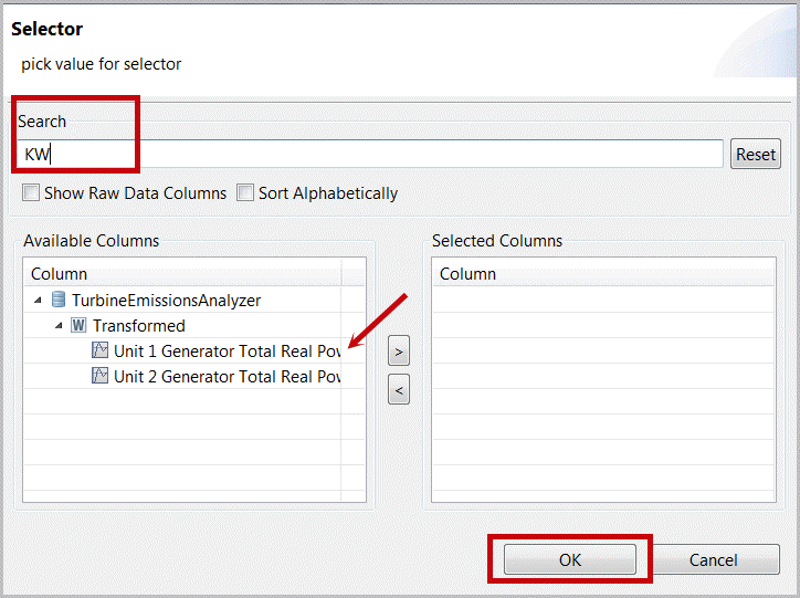 Set Limits for New Filter Rule
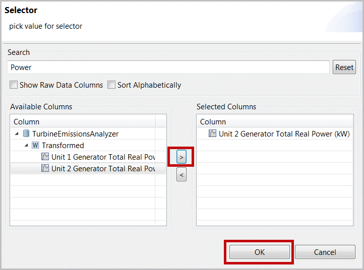
- Repeatthesesteps selecting “Unit 2 Generator Total Real Power (KW)”. Note that the options include a selector currently at “All” (i.e. both must be true, e.g. and) that can be changed to “Any” (i.e. either must be true, e.g. or). Also note that new Filters are automatically pinned (saved).Select Unit 2 Power for Filter
 New Filter Active When both Unit1 & 2 are In-Service
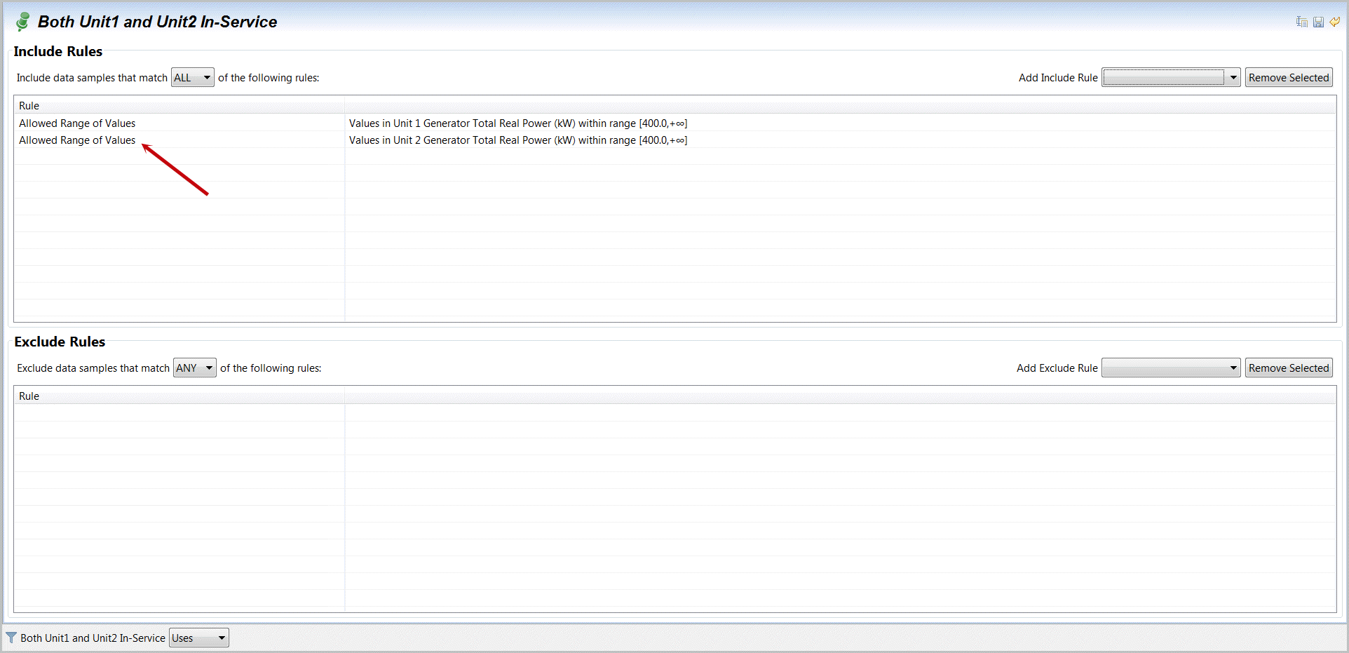
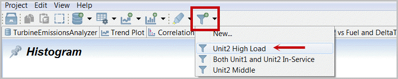
- From any plot (e.g. XY plot for “Efficiency2 vs Total KWh”)selectthe Filter icon [
 ]in the plot header on the far right.Filter Selection icon on far right
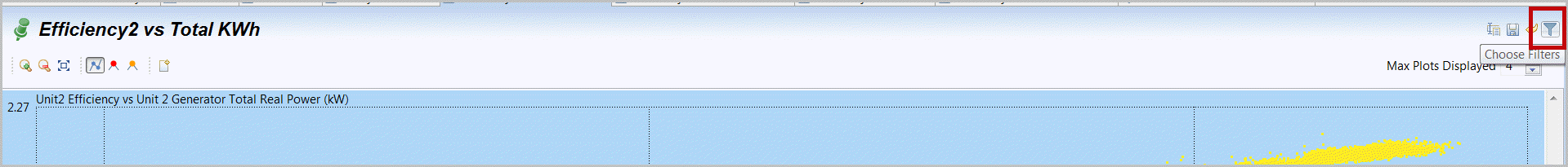 Select Unit1 and 2 In-Service Filter
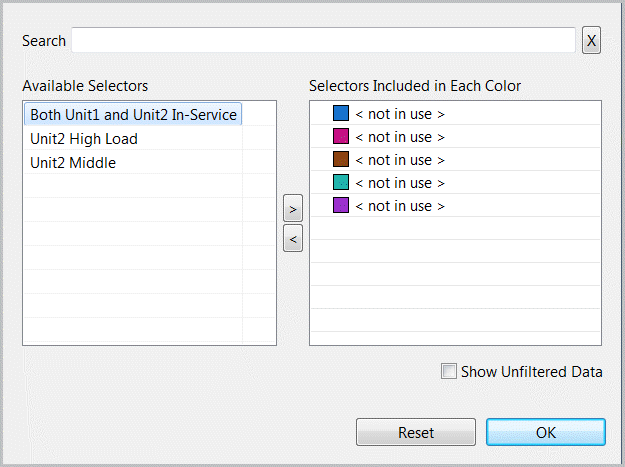
- Selectby double-click “Both Unit1 and Unit2…” or drag it to a color of choice.There is significant interactivity on active filter selection. What is selected will be displayed in the color assigned. If you double-click our “Both Unit1 and Unit2…” filter it will be pushed to the first available (blue) option. If you double-click a selected filter its opposite (<Not>) will be in place. If you drag two filters into one color (Unit2 High Load and Unit2 Middle) both will be in place with an All option, but if that is double-clicked it will convert to “Any”. Clear is available to clear all filters.One Filter Selected
 Repeat this filter selection for several of the displays. The active filter (once applied to that display) is described as “used” on the bottom of your plot footer. Filter included items are Blue, if you have not reset your highlighter this remains yellow. Items not included in highlighter or filter are displayed in Grey only if “Show Unfiltered Data” is selected. You can confirm that low efficiency performance occurs when both turbines are in service.Filter Active with Highlighter on High Efficiency
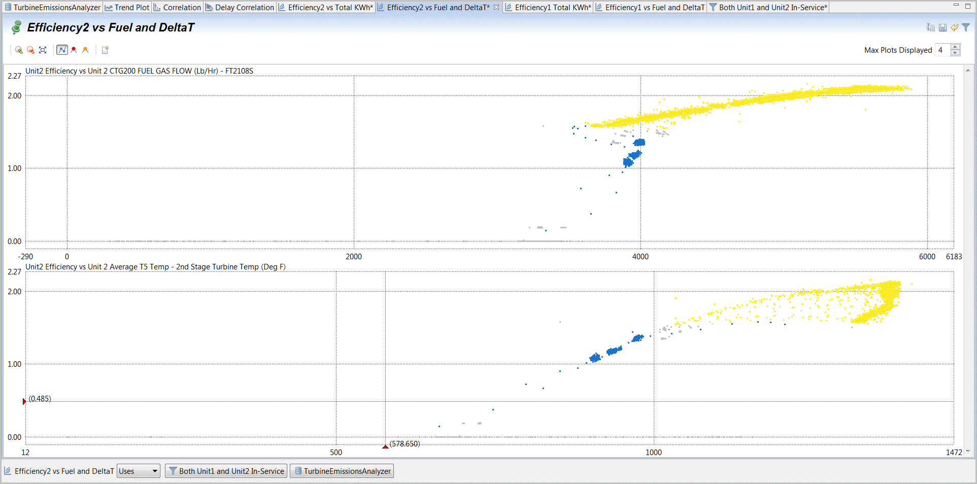 Filter Active with “Show Unfiltered” selected
- We want to expand the filter for “Unit2 High Load” and just copy the range for Unit1 so that NOx at high loads can be compared to NOx at Mid loads that we understand is mostly common between Unit1 and Unit2.Selectthe “Unit2 High Load” filter.Adda rule, for an “Allowed Multi-Range of Values”.Select Unit2 High Load Filter
 Add Multi-Range of Values Filter
- Select“Add”.Select Data Column.SelectandEnterthe same ranges for values in Unit 2 Generator Total RealPower (KW) [5850] leaving high limit empty,selectOK.Select“Add”, “Select Data Columns” andselectUnit 1 Generator Total Real Power and set the low limit to 5850 and OK again. You may now rename the Filter to “High Load”. You may want to edit the original rule and adjust limits. Just select and select 'edit' or double-click on the edit rule and make sure your Include Rules have “Any” selected, i.e. if either Unit1 or Unit2 are running at full loads on each limit definition.Add Multi-Range Rule
 Configure New Rule
 High Load Filter
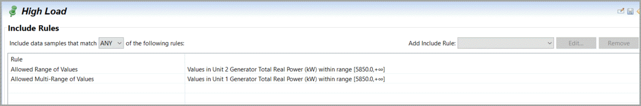
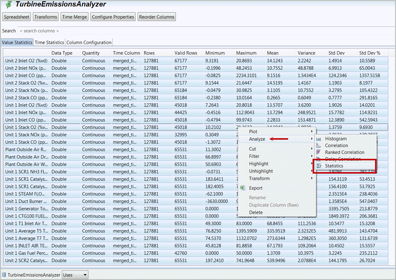
- Selectthe first Correlation tab. This is a display of each point in this project.Selectthe “Select All” Icon [
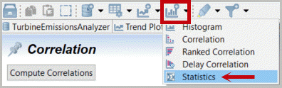
 ] from to top of the window and right mouse-click, SelectAnalyze, Statistics. You may alternativelySelectthe Analyze Icon [
 ] and Statistics then select all transformed variables in our Turbine Emissions dataset.Create Statistics Table with all variables from Correlation plot
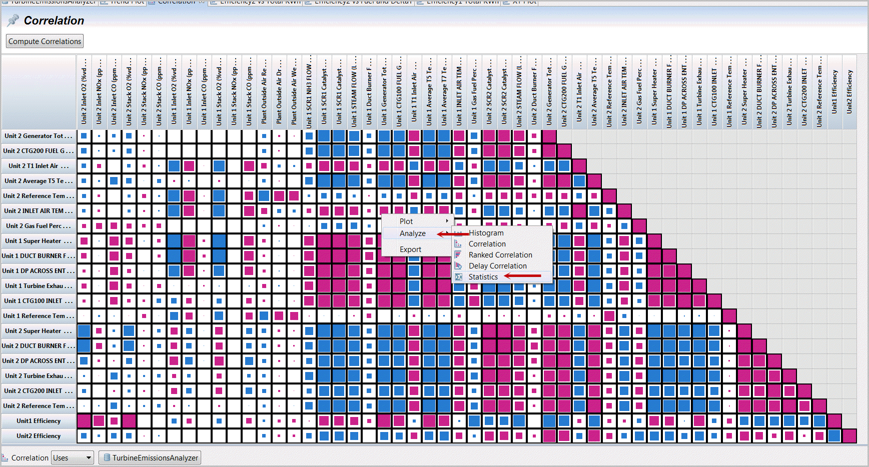
OR
Create Statistics Table with all variables from Correlation plot
Generating Analysis Table from Dataset Manifest
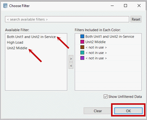
- Selectthe filter and include both “Unit1 and Unit2” and “Unit2 Middle”. SelectOK.“Show Unfiltered Data” includes all data.Select Active Filters
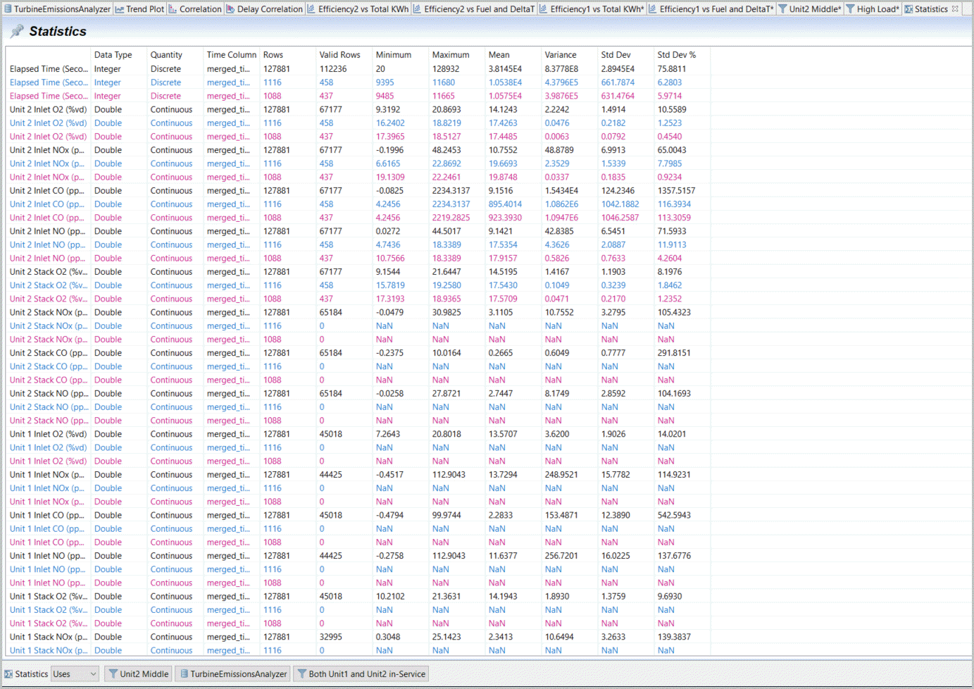
- This calculates and displays statistics for the parameters selected (on display selected or from columns selected from the Analysis icon on the top). Filters are displayed and used.Statistics with Filters
Provide Feedback