
Key approaches
Optimizing
FactoryTalk®
Optix™
applications requires a thoughtful balance between
performance, maintainability, and clarity. Throughout this document, we will explore key
approaches to achieve this balance such as:- Approach types
- Approach use cases
- How to implement each approach efficiently
These concepts originally come from the world of web design and cross-platform
applications, but are now essential in industrial HMIs, where the same application can
be displayed on very different devices.
- Scalable approach:A scalable approach on an interface consists of resizing proportionally while maintaining layout, positioning, and readability, regardless of the device’s resolution.For example: A layout designed at 1920×1080 that also fits correctly at 1280×720 or 3840×2160.
- Adaptable approach:An adaptive approach on an interface consists of adjusting its layout based on the device or resolution, loading different structures accordingly.For example: A dashboard that appears compact on a tablet and expanded on an industrial panel PC.
- Responsive approach:A responsive approach on an interface rearranges its contents in real-time depending on available space, without switching pages.Example: A grid that changes from 4 to 2 columns as the window is resized.
When to use each approach
The table below shows the recommended approach for each interface scenario:
Scenario | Recommended Approach | Implementation procedure |
Implement a scalable approach
You can easily achieve scalability in
FactoryTalk®
Optix™
by using the alignment properties of
containers.
NOTE:
See Configure a scale layout
For example, to create a header, use a
Panel
object and set
its horizontal alignment to Stretch
. This ensures that
regardless of the final resolution, the object spans the full available width.
IMPORTANT:
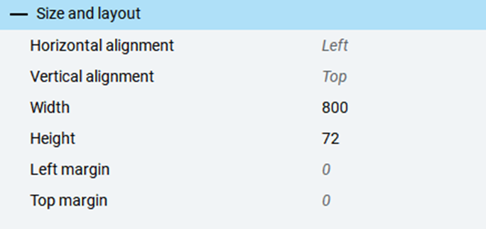
Assigning fixed sizes to container
objects prevents the interface from scaling across different screen resolutions.
Only assign fixed sizes if necessary.
Size | Outcome |
|---|---|
800px |  |
1280px |  |
TIP:
Set container alignment to
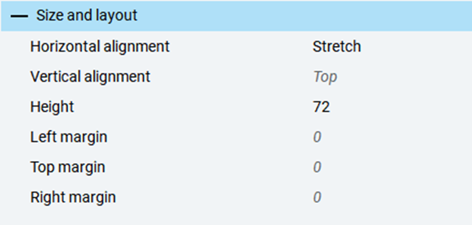
Stretch
to allow automatic space distribution based on
the resolution. Even if the application is developed at a fixed resolution, elements
will scale at runtime to adapt to their container.
Size | Outcome |
|---|---|
800px | |
1280px |  |
Implement an adaptive approach
When
designing for widely different resolutions (for example, 1920x1080 vs. 480x272), you
must create separate layouts. Use the
Panel Loader control
to
dynamically load different layouts based on resolution.To determine the
screen resolution, use the
Width
and
Height
properties of the
MainWindow
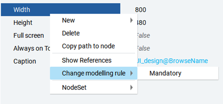
. Set the Change modelling
rule
of these properties to Mandatory
to
ensure these values are available at runtime.
IMPORTANT:
The use of the
Change modelling rule
feature
is meant for advance users only. You can view this feature only if you activated the
Advanced mode
in the FactoryTalk Optix Studio
Options
panel.Limit the use of this feature to this specific
scope to avoid any unexpected behaviours.
TIP:
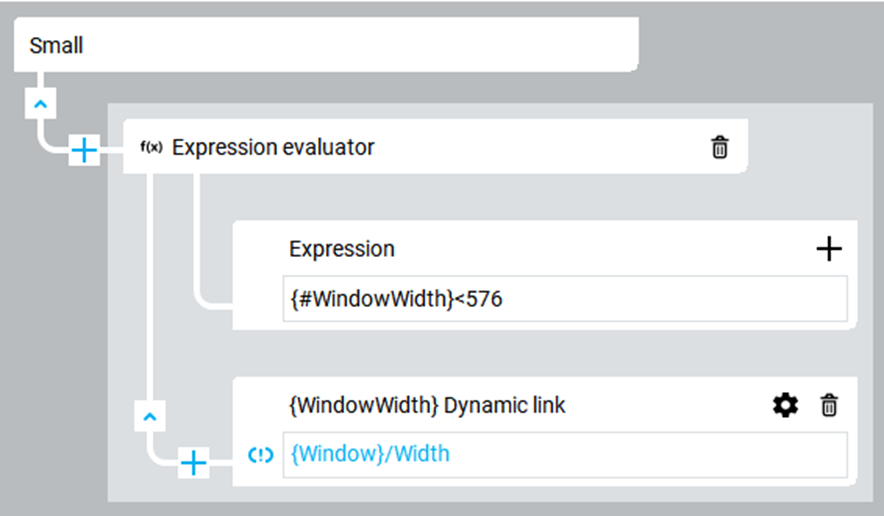
It is good practice to store calculated
values in helper variables within the
MainWindow
, especially
if they are used in multiple places. This avoids repeating Complex
Dynamic Links
composed of multiple converters, reducing node count
and improving performance.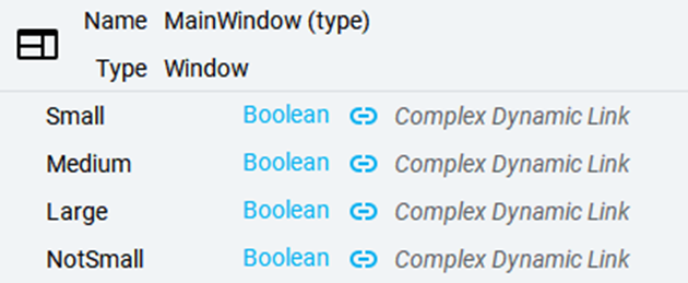
Implement a responsive approach
Besides using the
Panel Loader
, conditional visibility is key
to responsive design. For example, a side menu might only appear above a certain
screen width, while a toggle button appears below that threshold.The
GridLayout
is essential for arranging content dynamically.
It allows defining the number of rows and columns.You can also use the
VerticalLayout
and
HorizontalLayout
features by setting the
Wrapping
attribute to Active
in
the Properties
panel.
WARNING:
This may cause layout overflow. In that case,
wrap the
GridLayout
in a ScrollView
to
maintain full visibility.
TIP:
See Configure a grid layout.
Provide Feedback